Are you looking to use Python for the hexabin visualization on a Google map? Here we go!
A hexbin map is a specific type of map where each region is represented as a hexagon. hexagon is a closed shape polygon that has six equal sides and six equal angles. In the case of any regular polygon, all its sides and angles are equal. In this section, we will learn how to visualize data with hexagons on a Google Map and a hexbin map. Moreover, we will also learn the basics of the H3 module which divides the whole world map into various hexagons.
Hexabin Visualization of Data in Python
Hexbin plots are visualization plots that take in lists of X and Y values and return what looks somewhat similar to a scatter plot, but where the entire graphing space has been divided into hexagons and all points have been grouped into their respective hexagonal regions with a color gradient indicating the density of each hexagonal area.
One of the most important advantages of Hexagon plotting we can easily plot Density heatmaps (using a color gradient to display density differences) using them.
Hexabin Visualization Using Matplotlib Module
Now, we create various maps with hexagons showing the intensity of the data points. First, we will create a random dataset using the NumPy module and then will visualize the data in hexagons.
# importing the required modules
import numpy as np
import matplotlib.pyplot as plt

# creating random x and y variables
x = np.random.normal(size=(1, 1000))
y = np.random.normal(size=(1, 1000))

# this line  is hexabin visualization
plt.hexbin(x, y, gridsize=25, cmap="twilight_shifted")
Output:

As you can see, more datasets are found around 0 as expected because we had used created random numbers from a normal distribution. You can change the coloring of the hexbin map by changing the value of cmap parameter to any of the following:
- Perceptually
- Uniform Sequential
- magma
- plasma
- Purples
- Blues
A hexagon is a histogram-like chart where each hexagon represents the density of samples. We can also visualize the points themselves scattered within these hexagons by plotting scattered plots on them.
# building hexagons
plt.hexbin(x,y,gridsize=15, mincnt=1, edgecolors="none", cmap="twilight_shifted")

#  hexabin visualization
plt.scatter(x,y, s=2, c="white")
plt.show()
Output:

As you can see, we have now visualized the heatmap of the hexagon along with the data points themself.
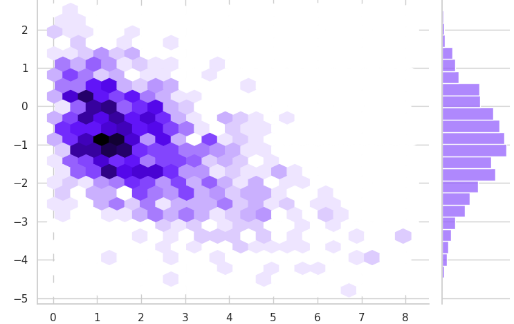
Hexabin Visualization Using Seaborn Module
Seaborn is a library that uses Matplotlib underneath to plot graphs. It is mostly used to visualize random distributions. And we also discussed that hexagons are actually a different way of representing bar plots. This time we will plot bars along with hexagons using the Seaborn module.
# importing the required module
import seaborn as sns

# setting the theme style
sns.set_theme(style="whitegrid")

# creating random numbers
rs = np.random.RandomState(11)
x = rs.gamma(2, size=1000)
y = -.5 * x + rs.normal(size=1000)


# plotting hexabin visualization
sns.jointplot(x=x, y=y, kind="hex", color="#9560FD")
Output:

As you can see, we have plotted the bar along the axes and then shown the same bars in the form of a hexagon heatmap.
Plotting Hexagons on Google Map Using Python
Now we will use a JSON file that contains the hexagons of Bishkek city. We will use different Python modules to visualize these hexagons on a Google map and without the map. You can access the JSON file and the source code from my GitHub account.
You may also like: Image Processing Using TensorFlow
First, let us import the JSON file and print out the hexagons.
# importing the module
import geojson

# opening the json file and loading
with open('Bishkek.json') as f:
    file = geojson.load(f)
Now, we will explore this dataset and visualize it on Google map
Hexagons Visualization Using Pandas
Before visualizing the hexagons, we need to do a little preprocessing of the data and see what kind of data is actually present in our dataset.
# importing the module'
import geopandas as gpd

# converting the json to GeoDataFrame
gd_file = gpd.GeoDataFrame(file.features)


# adding few preprocessing steps
gd_file['id'] = [gd_file['properties'][i]['id'] for i in range(gd_file.shape[0])]
gd_file.drop(['type', 'properties'], axis=1, inplace=True)
gd_file.head()
Output:

As you can see, we have a geometry that contains the sides of the hexagon in the form of latitude and longitude. and the id is the unique id of each of the hexagons. Now, let us visualize these hexagons (latitude and longitude).
# plotting the hexagons
gd_file.plot()
Output:

As you can see, we have visualized the whole of Bishkek city using the latitude and longitude of the Hexagons.
Hexagon With Google Map Using Folium
Now, we will use the folium module to visualize the hexagons of Bishkek city on a Google map.
# importing folium
import folium

# creating the map
map = folium.Map(location=[42.85000, 74.59000], zoom_start=11, tiles='CartoDB positron')

# adding the json file to the map
folium.GeoJson(file).add_to(map)

# showing the map
map
Output:

As you can see, we visualize the hexagons on a Google map. If you zoom the map, you can see the hexagons clearly as shown below:

Summary
Visualization lets us comprehend vast amounts of data at a glance and in a better way. It helps to understand the data better to measure its impact on the business and communicates the insight visually to internal and external audiences. In this article, we learned how we can visualize hexagons heatmaps and hexagons on a Google map using various Python modules.